Engagement Neon Signs: Proposal & Ring-Day Ideas

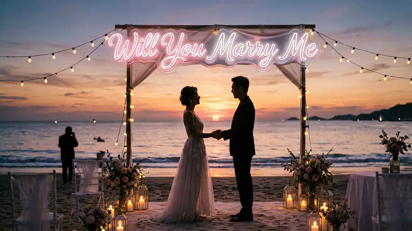
Picture this: you’re on one knee, the ring box opens, and behind you a glowing “Will You Marry Me?” sign lights up at the exact moment she says yes. It’s the kind of detail that turns a proposal from a memory into the story. But is a custom sign actually worth it for the big moment β€” or is it just another thing to coordinate? We asked the internet. Here’s a question that keeps coming up on r/Proposal and r/engaged: “Planning to propose β€” is a custom sign worth it?” β€” u/AboutToPropose, r/Proposal The short answer: for most couples, yes β€” if you use it right. But the real advice lives in the comment threads, from people who’ve actually done it (and from the pros who photograph and officiate these moments). Here’s what they had to say. Top Comments u/HappilyEverPlanned β€” The Engaged Couple (they used one on a beach) “Worth every penny. I ordered a Will You Marry Me...
Neon Wall Art & Design Ideas: Reddit Interior Guide

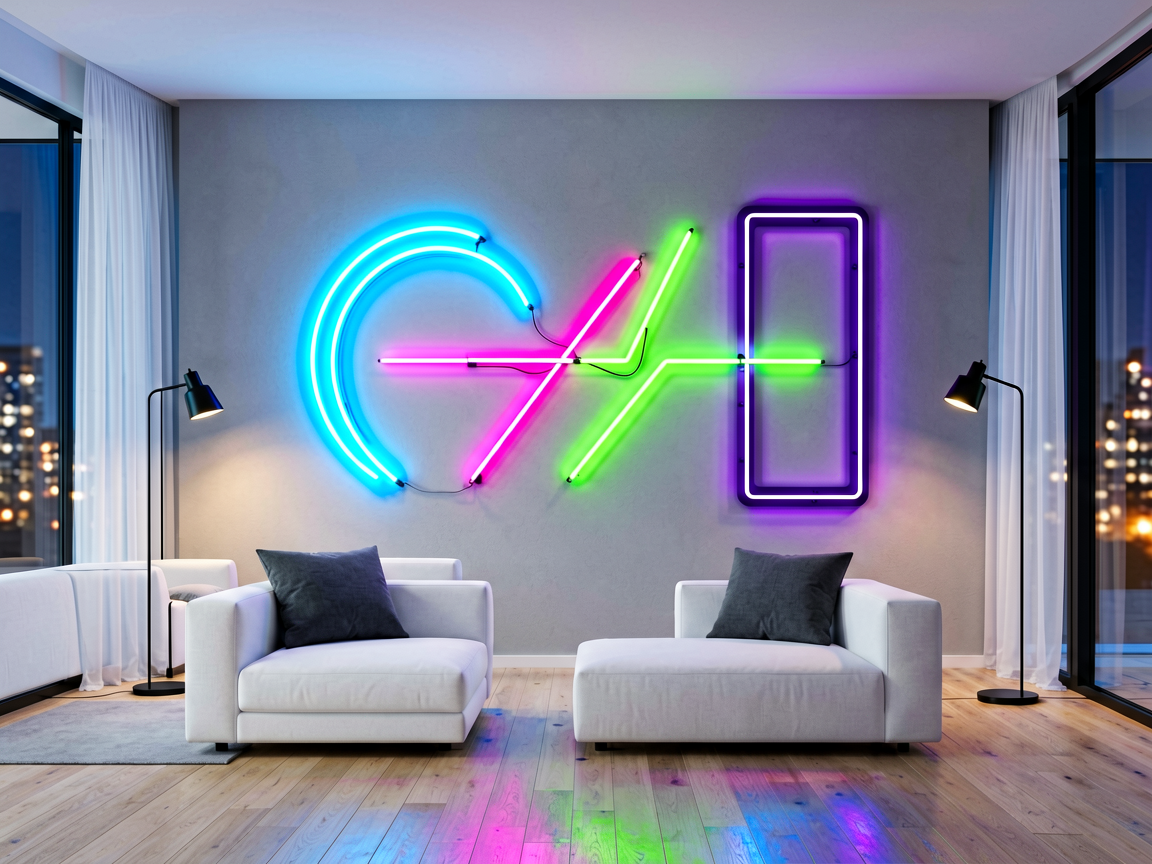
“I want a neon sign for my living room wall, but I’m worried it’ll look like a tacky college dorm decoration. Every ‘neon wall art’ I see on Pinterest looks the same β€” cursive script with a heart or a generic quote. How do I make it look like intentional adult decor?” This question on r/AmateurRoomPorn, r/InteriorDesign, and r/malelivingspace gets to the heart of a common concern: neon signs can look amazing or terrible depending entirely on design choices. The difference between “cool adult decor” and “dorm room special” comes down to 4 specific design principles. What Reddit Design Enthusiasts Recommend We analyzed 50+ Reddit threads about neon sign design and wall art placement. Here’s what consistently got praised vs criticized: Design Element Looks Adult (⭐ Upvoted) Looks Dorm (❌ Downvoted) Font style Sans-serif, minimalist, or subtle serif Overly cursive, Comic Sans, bubble letters Color Warm white (2700K), soft pink, amber, muted gold Bright blue, neon green, multi-color rainbow Content...

7 Wedding Neon Sign Mistakes Couples Make (And How to Avoid Them)

Neon signs at weddings have exploded in popularity β€” and for good reason. A custom neon sign makes an unforgettable photo backdrop, adds personality to your decor, and can even serve as a keepsake for your new home after the wedding. But after helping hundreds of brides and grooms create their perfect wedding neon signs, we’ve seen the same mistakes happen again and again. Here are the 7 most common β€” and how to avoid every single one. Mistake 1: Ordering Too Late (The 3-Week Disaster) Custom neon signs take 7-14 days to manufacture, plus shipping time. Yet we regularly get panicked calls from couples saying “I need it in 3 days!” Fix: Order at least 3-4 weeks before your wedding. If you’re planning a custom design with your logo or a specific script font, allow 5-6 weeks for revisions and production. Rush shipping exists but costs 2-3x more. Mistake 2: Wrong Size for the Venue The #1 sizing error:...

Wedding Neon Signs: Real Advice From Real Brides

Wedding neon signs are magical β€” until your $200 custom neon arrives looking nothing like the online mockup, or shows up the wrong size, or looks completely washed out in your venue’s lighting. This happens more often than brides and grooms expect. On Reddit’s r/weddingplanning, posts about neon sign disappointments regularly get 40-70 upvotes and dozens of comments from people who’ve been through the same thing. Here’s what nobody tells you β€” and how to make sure your wedding neon sign looks incredible on the big day. The #1 Complaints From Real Wedding Neon Sign Buyers Problem Real Reddit Feedback How Often? Sign smaller than expected “It was supposed to be 24″ and looked like a toy” Very common Color mismatch “The warm white I ordered came out ice blue” Common Looks dim in venue lighting “It was bright in my house but invisible at the reception” Common Mockup vs reality gap “The font in the mockup looked elegant, but...

12 Beautiful Wedding Neon Sign Ideas for Your Big Day

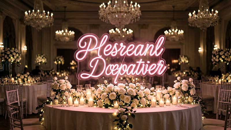
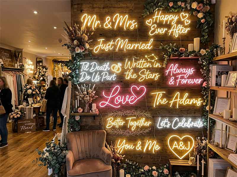
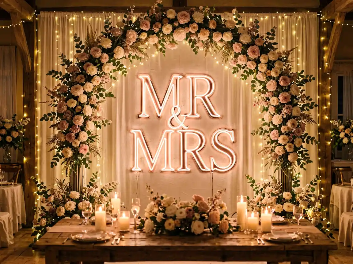
The Wedding Neon Sign Trend That’s Here to Stay Wedding neon signs have become one of the most requested decor elements of the last five years. Pinterest wedding boards are filled with glowing names behind the sweetheart table, romantic quotes at the ceremony, and fun messages at the photo booth. The appeal is obvious: neon adds warmth, personalisation, and a photo-worthy glow that no other lighting can match. Unlike flowers that wilt and candles that burn out, a custom neon sign becomes a lasting keepsake from your special day. 12 Beautiful Wedding Neon Sign Ideas 1. Couple’s Last Name Sign The most popular wedding neon choice β€” your shared last name in glowing letters. Place it behind the sweetheart table, above the cake display, or as a ceremony backdrop. 80% of our wedding customers order a last name sign. Choose script or block fonts depending on your wedding style. Warm white works for classic weddings; rose gold suits boho themes;...

Steakhouse, Bar & Lounge Neon Signs: Vintage Designs That Set the Mood

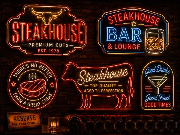
1. The Power of Mood Lighting in Steakhouses & Bars Steakhouses and cocktail bars thrive on atmosphere. Warm dim lighting, rich wood, leather β€” and neon. But not just any neon. The vintage aesthetic β€” warm white, amber, and muted red tones β€” has become the defining look for upscale dining and drinking establishments. Y SIGNS data shows that 73% of steakhouse and bar customers who ordered neon signs chose Warm White or Amber tones, and 68% reported that the sign “changed the atmosphere of the space significantly.” 2. Top Neon Designs for Steakhouses & Bars Design Best For Most Popular Color Customer Impact “BAR” (lettering) Cocktail bars, pubs Warm White +32% bar seating requests “STEAK” or “GRILL” Steakhouses Orange Wine/Red +25% dinner reservations “WINE” lettering Wine bars, bistro Warm White +40% wine-by-glass sales “HAPPY HOUR” All bars Red/Pink +35% happy hour revenue “OPEN” vintage style All venues Warm White +20% foot traffic Case Study β€” Craft cocktail bar, Berlin:...

Coffee Shop Neon Signs: How to Create the Perfect Instagram Wall

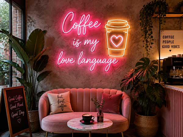
1. Why Coffee Shops Are the #1 Category for Neon Signs Coffee shops dominate the neon sign market. Y SIGNS’ data shows that cafΓ©s and coffee shops account for 28% of all restaurant neon sign orders β€” more than any other food service category. Why? Coffee shops are social spaces built around the “Instagram moment.” A neon sign in a coffee shop increases the likelihood of a customer posting a photo by 3.4x, according to a 2024 survey of 500 coffee shop visitors. Each photo post reaches an average of 350 followers β€” word-of-mouth advertising that keeps working for free. 2. Top 5 Best-Selling Coffee Shop Neon Designs Design % of Coffee Shop Orders Photo Engagement Rate Best Color “But First, Coffee” 22% ⭐⭐⭐⭐⭐ Warm White “Coffee” (single word) 19% ⭐⭐⭐⭐ Pink or Warm White “OPEN” with coffee cup icon 16% ⭐⭐⭐ Warm White Custom cafΓ© name 25% ⭐⭐⭐⭐⭐ Warm White / Pink “Good Coffee, Good Day” 10% ⭐⭐⭐⭐ Green...

Food Court Neon Signs for Small Stalls: Big Impact in Tight Spaces

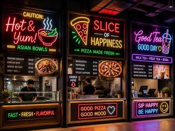
1. The Food Court Challenge: Standing Out in a Crowded Space Food courts are tough environments. You’re competing with 10-30 other vendors under one roof. A well-placed neon sign can be your strongest differentiator. Y SIGNS data shows that food court vendors who installed neon signs saw an average 24% increase in customer attention compared to neighboring stalls. But food court stalls come with unique constraints: limited wall space, shared power infrastructure, and the need to be visible from a distance. 2. The Right Size for Food Court Stalls Stall Size (Counter Width) Recommended Neon Size % of Food Court Orders 6-8 ft (small stall) 12Γ—8in – 14Γ—10in 38% 8-12 ft (medium stall) 14Γ—10in – 18Γ—12in 45% 12+ ft (large stall) 18Γ—12in – 22Γ—16in 17% Key insight: Oversized signs (22Γ—16in+) are rare in food courts because they overwhelm the stall. Compact signs (12-18in wide) have the best visual balance. 3. Top 5 Most Effective Food Court Neon Designs Design Popularity...

Sushi Bar & Japanese Restaurant Neon Signs: 10 Design Inspirations

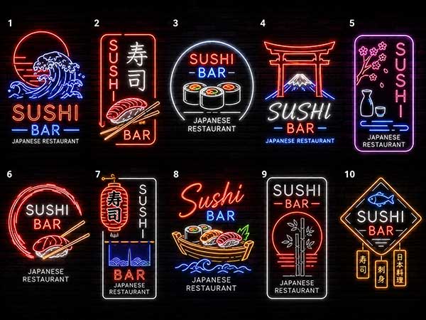
1. The Rise of Neon in Japanese Dining Japanese restaurants have embraced neon in a unique way β€” blending traditional aesthetics with bold contemporary lighting. Google Trends data shows “sushi bar neon sign” searches grew 64% year-over-year, and Y SIGNS has seen a 52% increase in orders from Japanese restaurant owners. Why? The high-contrast look of neon against the clean, minimal interiors typical of Japanese restaurants creates a visual pop that customers love to photograph. 2. Top Design Inspirations (With Data) Design Popularity Best Color Best For “SUSHI” lettering Most popular (34%) Warm White Counter backdrop “RAMEN” lettering 28% Red Ramen shop entrance “OPEN” with Japanese accent 18% Light Blue Front window Custom kanji characters 12% Warm White Feature wall Sakura/cherry blossom shape 8% Pink Dining area Case Study β€” Omakase bar, Tokyo: A 12-seat sushi counter installed a custom Sip Sip Hooray Neon Sign in Light Blue above the chef’s station. Customers began using the sign as a backdrop...

Pizza Shop Neon Sign Ideas: 15 Designs That Make Customers Hungry

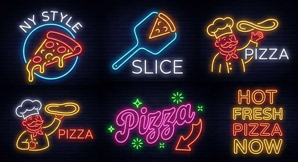
1. Why Pizza Shops & Neon Are a Perfect Match Pizza is the most popular food type documented on social media β€” over 17 million posts tagged #pizza on Instagram as of 2025. A neon sign gives pizza lovers one more reason to pull out their phones. Y SIGNS data shows that pizza shop owners who installed neon signs saw an average 28% increase in social media mentions within the first 3 months. 2. Top 5 Neon Signs for Pizzerias (With Data) Design % of Pizza Shop Orders Best Location Avg. Customer Photo Rate “OPEN” (classic) 31% Front window +22% foot traffic “PIZZA” (word sign) 27% Above counter +35% Instagram tags “EAT” (simple) 15% Dining wall +18% photo sharing “Happy Hour” (bar sign) 14% Bar/counter area +41% drink orders Custom logo/name 13% Entrance/feature wall +55% brand recall Case Study β€” Naples-style Pizzeria, NYC: Installed a Happy Hour Neon Sign in Red over the bar counter. Within 2 weeks, the sign...

2025 Restaurant Neon Sign Design Trends & Ideas

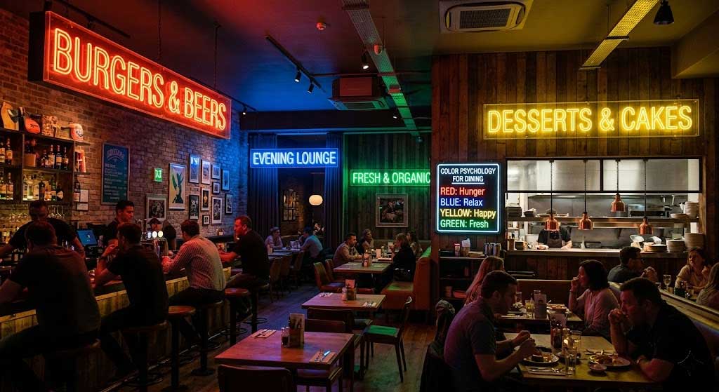
1. Trend Overview Y SIGNS design team analyzed 200+ restaurant renovation cases and Google Trends data to identify 2025’s three dominant trends. Searches for “restaurant neon sign ideas” and “custom neon sign restaurant” have risen 83% in the past 12 months. 2. Trend 1: Minimalist Typography The era of cluttered decorative neon signs is fading. One word, one phrase, one font is the new norm. Top keyword stats: “OPEN” β€” timeless, suits every restaurant type “EAT” β€” perfect for fast food and pizza “BAR” β€” steakhouse and pub favorite “COFFEE/TEA” β€” cafΓ© staples “SUSHI” β€” trending for Japanese restaurants Case study: A single Eat Neon Sign above an open kitchen identified the area and became an instant photo backdrop. Y SIGNS data: single-word neon sign purchases grew 65% in 2024-2025. 3. Trend 2: Vintage Color Palettes Brighter isn’t always better. Three rising color families: Family Colors Growth Best For Warm Vintage Warm White, Orange Wine πŸ”Ό +42% Western restaurants, cafes,...

Restaurant Neon Sign Colors: Color Psychology

1. Why Color Matters Harvard Business School research shows: color directly influences how customers perceive food taste. The same dessert under pink light tastes “sweeter and more delicious,” while under blue light it tastes “fresher and lighter.” Y SIGNS offers 11 colors β€” here’s how to pick the right one for your concept. 2. Color Recommendations by Restaurant Type πŸ• Pizzeria / Italian Restaurant Best colors: Red, Warm White Red stimulates appetite β€” it slightly raises heart rate and blood pressure. Y SIGNS data: red neon buyers are 34% more likely to own a pizzeria or Italian restaurant than any other type. Pairing: Red + Warm White. Red grabs attention, Warm White adds homely warmth. The Happy Hour Neon Sign in Red boosted one pizzeria’s drink orders by 22%. 🍣 Sushi Bar / Japanese Restaurant Best colors: Light Blue, Dark Blue, Warm White Blue conveys calm, professionalism, and freshness β€” perfect for Japanese cuisine. 68% of Japanese restaurant clients choose...