
“I want a neon sign for my living room wall, but I’m worried it’ll look like a tacky college dorm decoration. Every ‘neon wall art’ I see on Pinterest looks the same — cursive script with a heart or a generic quote. How do I make it look like intentional adult decor?”
This question on r/AmateurRoomPorn, r/InteriorDesign, and r/malelivingspace gets to the heart of a common concern: neon signs can look amazing or terrible depending entirely on design choices. The difference between “cool adult decor” and “dorm room special” comes down to 4 specific design principles.
What Reddit Design Enthusiasts Recommend
We analyzed 50+ Reddit threads about neon sign design and wall art placement. Here’s what consistently got praised vs criticized:
| Design Element | Looks Adult (⭐ Upvoted) | Looks Dorm (❌ Downvoted) |
|---|---|---|
| Font style | Sans-serif, minimalist, or subtle serif | Overly cursive, Comic Sans, bubble letters |
| Color | Warm white (2700K), soft pink, amber, muted gold | Bright blue, neon green, multi-color rainbow |
| Content | Single word, abstract shape, minimalist line art | Long quotes, song lyrics, pop culture references |
| Size relative to wall | 18-30″ (part of a gallery arrangement) | 48″+ dominating the whole wall |
| Mounting | Floating mount (1″ off wall for shadow effect) | Direct flat against wall with visible wires |
| Lighting context | Dimmable, paired with warm ambient light | Blazing alone in an otherwise dark room |
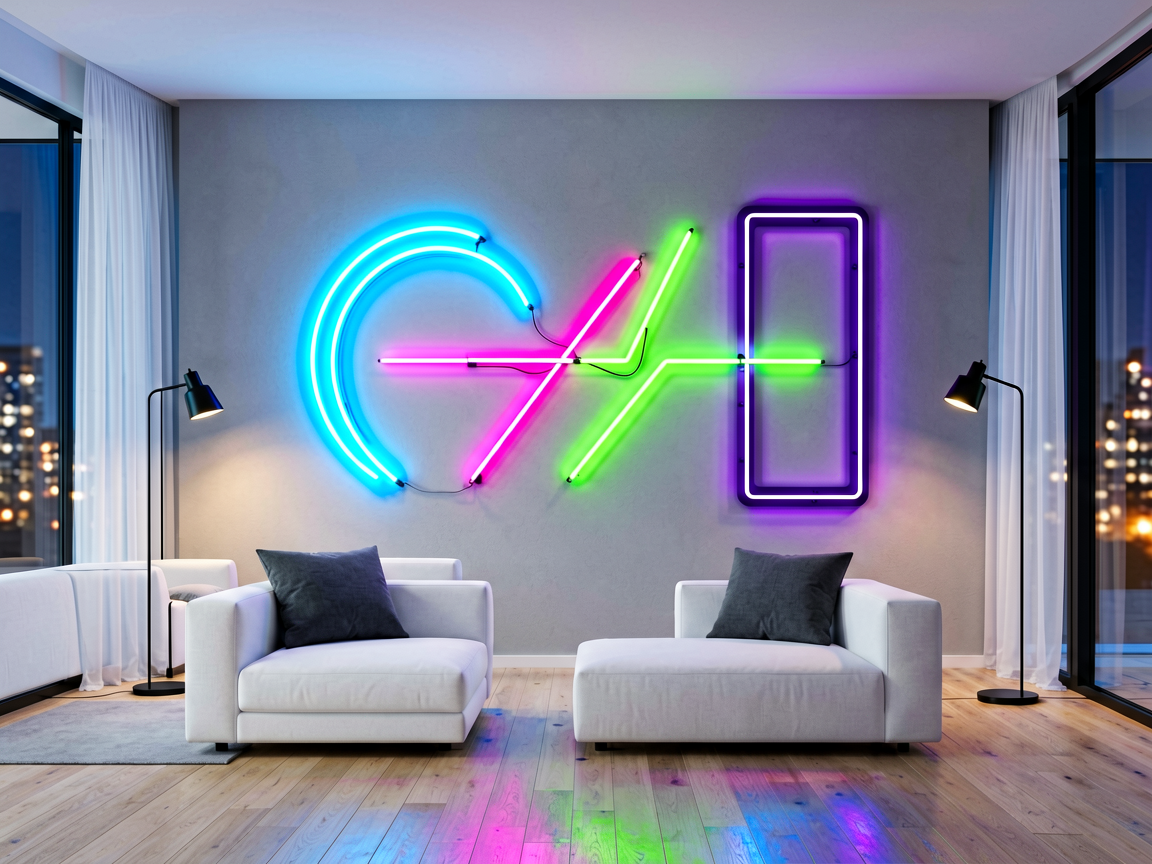
Neon Sign Design Ideas That Actually Work
From Reddit’s most upvoted neon decor posts:
1. The Minimalist Word Sign
A single word in a clean sans-serif font — “HOME,” “BAR,” “LIVE,” “DREAM,” or your family name. These work because they read like a design choice, not a slogan. Best in warm white or muted gold. Size: 16-24″ wide.
2. The Abstract Shape
Forget words entirely. A neon circle, crescent moon, geometric line, or abstract wave mounted on the wall reads as modern art, not signage. These are the most upvoted neon posts on r/AmateurRoomPorn. Size: 12-20″ diameter.
3. The Gallery Wall Accent
A small neon sign (10-14″) integrated into a gallery wall with framed prints, photos, and mirrors. The neon adds warmth and draws the eye without dominating. This is the #1 most praised approach on r/malelivingspace.
4. The Shelf Statement
A neon sign sitting on a shelf (not mounted on the wall) among books, plants, and decor objects. This makes the sign feel like one element in a curated display rather than the centerpiece. Works especially well on a fireplace mantel or bar cart shelf.
Real Reddit Design Success Stories
From r/AmateurRoomPorn (13K upvotes):
“I got a custom neon sign of just our last name in warm white, mounted 1 inch off the wall above our sofa. The shadow effect makes it look like a $500 art piece, not a $100 sign. Women especially love it — it’s warm and romantic without being cheesy.”
From r/malelivingspace (6K upvotes):
“I was skeptical about neon wall art until I saw someone use a small crescent moon neon sign in a gallery wall. It was subtle — you barely noticed it at first, then realized it was the focal point. I bought a similar one and it transformed my boring apartment wall.”
From r/InteriorDesign:
“The biggest mistake people make with neon wall art is buying signs with too many words. A 5-word quote in cursive doesn’t look like design — it looks like a motivational poster from 2015. One or two words max. Sans-serif. Warm white. Trust the process.”
Neon Wall Art — Design Investment Guide
| Style | Best For | Budget | Color Recommendation |
|---|---|---|---|
| Single word (sans-serif) | Living room, bedroom, office | $80–$150 | Warm white or rose gold |
| Abstract shape (moon, wave, circle) | Modern/minimalist spaces | $60–$120 | Warm white or amber |
| Gallery wall accent | Any room | $50–$100 | Matches gallery frame colors |
| Custom line art | Personal spaces | $100–$200 | Your choice |
Looking for neon sign design ideas that actually elevate your space? The key insight from Reddit’s most admired neon decor: less is more. One or two words in a clean font, warm color temperature, and thoughtful placement into an existing wall arrangement will always beat a giant glowing quote.
The bottom line from Reddit designers: Neon wall art can look sophisticated if you follow three rules: keep it simple (1-2 words or an abstract shape), use warm colors (white, pink, amber), and integrate it into your existing decor instead of making it the only thing on the wall. A minimalist neon sign in a gallery wall consistently gets the highest praise — it’s the “adult” way to do neon decor.
Looking for the perfect neon sign for your needs? Check out our baby shower – custom led neon sign, our just brew it – custom led neon sign, or our recording – recording studio sign to find exactly what you’re looking for.