
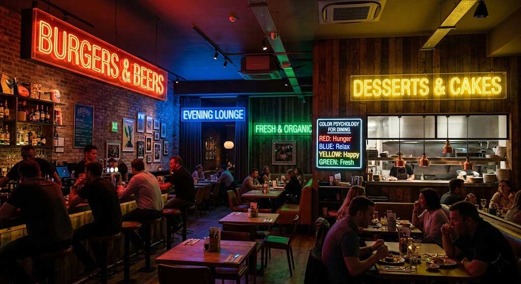
1. Why Color Matters
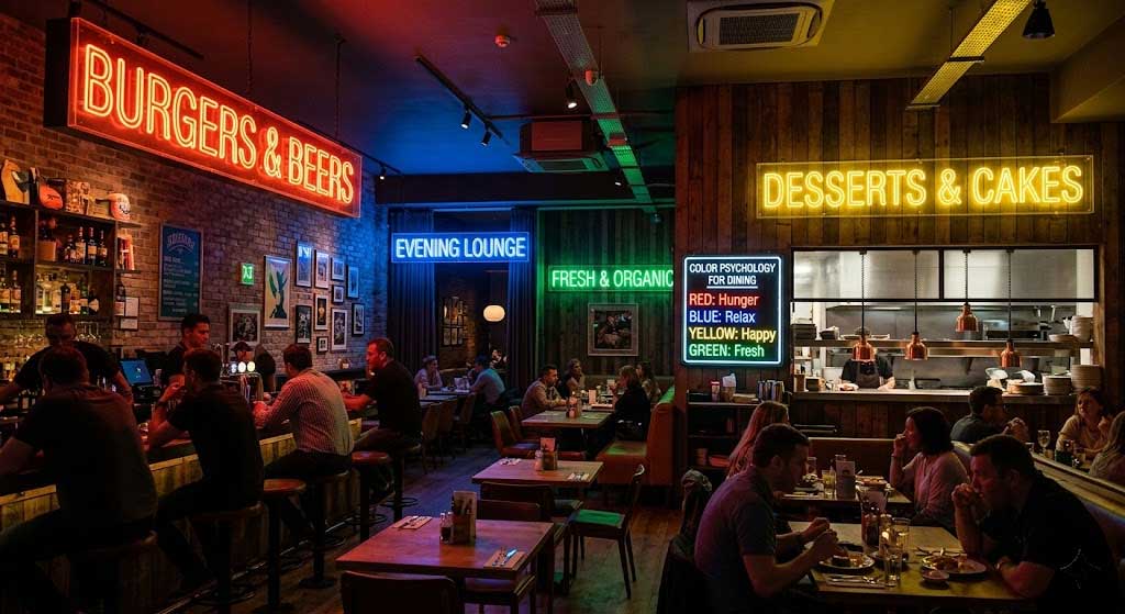
Harvard Business School research shows: color directly influences how customers perceive food taste. The same dessert under pink light tastes “sweeter and more delicious,” while under blue light it tastes “fresher and lighter.” Y SIGNS offers 11 colors — here’s how to pick the right one for your concept.
2. Color Recommendations by Restaurant Type
🍕 Pizzeria / Italian Restaurant
Best colors: Red, Warm White
Red stimulates appetite — it slightly raises heart rate and blood pressure. Y SIGNS data: red neon buyers are 34% more likely to own a pizzeria or Italian restaurant than any other type.
Pairing: Red + Warm White. Red grabs attention, Warm White adds homely warmth. The Happy Hour Neon Sign in Red boosted one pizzeria’s drink orders by 22%.
🍣 Sushi Bar / Japanese Restaurant
Best colors: Light Blue, Dark Blue, Warm White
Blue conveys calm, professionalism, and freshness — perfect for Japanese cuisine. 68% of Japanese restaurant clients choose cool-toned neon. While blue is known to suppress appetite, using it for the restaurant name rather than food imagery creates a premium feel. Try the Sip Sip Hooray Neon Sign in blue for your bar area.
☕ Café / Brunch Spot
Best colors: Warm White, Green, Pink
- Warm White: Most versatile, suits all styles
- Pink: Trending for Instagram-worthy interiors, highest photo engagement
- Green: Natural, healthy vibe for organic/health-focused spots
Y SIGNS’ But First Coffee Neon Sign is a café bestseller — 40% of café customers choose Warm White. Pair with Wine Time Neon Sign for an evening wine bar transition.
🥩 Steakhouse / Western Restaurant
Best colors: Warm White, Orange Wine
Amber tones make food look more appetizing — top-tier restaurants use warm light for this reason. Copper-toned metal frames with Warm White neon match industrial-rustic aesthetics perfectly.
🍸 Cocktail Bar / Lounge
Best colors: Purple, Pink, Light Blue
Bars need “vibe” over readability. Purple has the strongest premium feel. Light Blue dimmed to 50% brightness creates a moody late-night atmosphere.
3. The Golden Rule of Color Pairing
| Combination | Effect | Best For |
|---|---|---|
| Warm White + Pink | Warmth with pop | Dessert shops, cafés |
| Red + Warm White | Passion with comfort | Pizzerias, steakhouses |
| Light Blue + Warm White | Cool but human | Sushi bars, seafood restaurants |
| Green + Light Blue | Fresh and natural | Salad bars, health food spots |
| Purple + Pink | Upscale psychedelic | Cocktail bars, nightclubs |
4. Real Customer Cases
Salad bar, Shanghai: Warm White main text + Green accent graphics. The photo wall went viral on Xiaohongshu with 23,000 likes. Top comment keywords: “elegant” and “comfortable.”
Tea restaurant, Guangzhou: Red + Warm White with retro Hong Kong-style characters. First month foot traffic exceeded projections by 30%.
5. FAQ
Q1: Can I change the color after buying?
Y SIGNS neon colors are sealed inside the PVC strip during manufacturing — not changeable after purchase. Tip: request a color sample strip before ordering to test in your actual space.
Q2: Can I make a sign half red and half blue?
Yes! Y SIGNS supports dual-color custom orders. Specify color positions and codes when ordering — we’ll produce a mockup for your approval first.
Q3: Safest color choice for a new restaurant?
Warm White is always safe. It works for every restaurant type from street food to fine dining. Add a second colored sign later for visual layers.
Q4: Light vs dark wall — different color advice?
Light walls (white/beige/gray) — all colors work; red, pink, and blue pop best. Dark walls (black/navy/brick red) — choose Warm White or Pink for contrast. Red appears dim on dark backgrounds — avoid.
Q5: Does neon sign color affect customer photos?
Yes. For the most flattering guest photos: choose Warm White or Pink. Warm White makes skin tones appear +20% brighter, and Pink adds a soft filter effect. Avoid pure blue or purple as the main light source — they make skin look pale or greenish.