
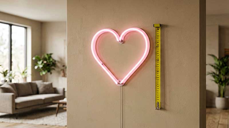
One of the most common questions we get from first-time buyers is simple: what size should my neon sign be? It matters, because a sign that is too small gets lost on a large wall, while one that is too large overwhelms the room and can even feel tacky. The root of the problem is that a phone screen or laptop display is a terrible way to judge physical size — a design that looks perfectly proportioned on your 6-inch phone screen may look tiny once it is on a wall.
Related products: Will You Marry Me Neon Sign Romantic Proposal Wedding, Happy Birthday Neon Sign – Party Backdrop, Custom Gift, Merry Christmas Neon Sign – Festive Holiday Wall.
This guide fixes that. We will cover the golden rule of neon sign sizing, a quick neon sign size chart, how big your letters need to be for a given viewing distance, what size neon sign works for a wedding, and a pre-order checklist you can run through in two minutes.
The Golden Rule of Neon Sign Sizing
Two rules of thumb do most of the work, and they agree with each other.
The first is the 60–70% rule: a neon sign should fill roughly 60–70% of the space you are placing it in — not all of it, and definitely not 20% of it. Ordering too small (lost in a big wall) or too big (overwhelming the space) is the number-one sizing mistake people make.
The 2:1 Wall-to-Sign Ratio
The second is the two-thirds wall rule. Your neon sign should take up no more than two-thirds of the width of the wall it hangs on, and no less than one-third. For example, if your wall is 48 inches wide, your sign should be between 16 and 32 inches wide. A 24-inch sign would be the perfect middle ground. This keeps the sign from looking either dwarfed or cramped.
For vertical signs, apply the same ratio to the height measurement. And remember that the sign includes any acrylic backing — if your sign has a large backing plate, measure the total visual footprint rather than just the neon tubing itself.
Neon Sign Size Chart: Size by Wall Space
Use this quick reference to go from your wall size to a starting dimension. It works for both the width of a horizontal sign and the height of a vertical one.
| Your Wall Area | Recommended Sign Size | Example |
|---|---|---|
| Small (2′ × 2′) | 8″ – 12″ wide | Dorm room, small shelf |
| Medium (3′ × 4′) | 16″ – 20″ wide | Bedroom wall, office cubicle |
| Large (5′ × 6′) | 24″ – 32″ wide | Living room, bar wall, retail display |
| Extra large (8′+ wide) | 36″ – 48″ wide | Storefront, restaurant dining room, stage backdrop |
| Full storefront | 48″ – 72″+ wide | Commercial building, marquee |
Room-by-Room Size Recommendations
Different rooms call for different dimensions:
- Bedroom: a small to medium sign at 18 to 24 inches wide is ideal above the headboard.
- Home office and gaming rooms: a medium sign at 24 to 30 inches works well above the desk or monitor setup.
- Living room: 30 to 40 inches above a couch or mantelpiece creates a striking focal point.
- Cafes, bars and retail stores: consider large signs of 36 to 60 inches that can be seen across the room.
- Storefront windows: oversized signs up to 72 inches wide attract foot traffic from the street.
When in doubt, use painter’s tape to outline the proposed size on your wall and step back to evaluate. For a step-by-step method, see our guide to how to measure your wall for a neon sign.
Size Comparison with Everyday Objects
Here is a simple way to visualize size without a tape measure:
- 8″ wide = about the width of a standard sheet of paper (8.5″)
- 12″ wide = a laptop screen diagonal (~13″)
- 16″ wide = a standard keyboard width (~18″)
- 24″ wide = a typical TV screen (24″ measured diagonally)
- 36″ wide = a yardstick
- 48″ wide = a standard door width
Neon Sign Sizes: How Big Should the Letters Be?
Letter height is where most sizing mistakes actually happen. People underestimate how tall letters need to be to read well from a distance.
Viewing Distance and Letter Height
| Viewing Distance | Minimum Letter Height | Recommended |
|---|---|---|
| 2 feet (desk / shelf) | 1.5″ | 2–3″ |
| 5 feet (bedroom / office wall) | 3″ | 4–6″ |
| 10 feet (bar counter, cafe table) | 5″ | 6–8″ |
| 20 feet (restaurant dining area) | 8″ | 10–12″ |
| 50 feet (storefront, street view) | 15″ | 18–24″ |
Pro tip: cursive and script letters appear smaller than their actual height because of the thin strokes. If you choose a script font, bump the letter size by 20–30%. Block letters and sans-serif fonts are much more readable at smaller sizes.
Viewing distance is the most overlooked factor in neon sign size selection. As a general rule, add 10 inches of width for every 10 feet of viewing distance. A sign viewed from 20 feet away (such as a storefront sign) needs at least 20 inches of readable text width, while a bedroom sign viewed from 6 to 8 feet is fine at 16 to 20 inches. If your design uses thin cursive lettering, increase the overall size by 20 percent to maintain legibility.
How Many Characters Fit?
The number of characters in your text directly dictates the required sign width. A single short word like “LOVE” or “BAR” at 16 inches wide allows for large, bold letters, while a full sentence like “Welcome to Our Happy Place” at the same width would require much smaller text. As a guideline, allow 1.5 to 2.5 inches per character for standard fonts. A 24-inch wide sign comfortably fits 10 to 16 characters in a single line. For longer phrases, use two lines of text with a 2-inch gap between them — two-line signs need more height but can be narrower in width. If you are designing a sign with both text and a graphic element, reduce the character count by 30 percent to make room for the artwork.
Multi-Word Signs: Layout Considerations
Many buyers make the mistake of stacking long phrases on a single line. Any word over 8–10 characters should be split onto two lines. Good layout rules:
- Keep line height at least 1.5× letter height so lines do not bleed visually.
- Center-align for a traditional look, left-align for a modern one.
- 2–3 words per line maximum for readability.
- Leave extra space around punctuation marks.
Font Choice Matters More Than You Think
Your sign’s readability depends heavily on the font you choose. Here is how different fonts affect the final look:
| Font Style | Readability | Best For | Worst For |
|---|---|---|---|
| Sans-serif (e.g., Helvetica, Arial) | ★★★★★ | Business signs, storefront, “OPEN” | Artistic / romantic looks |
| Serif (e.g., Times, Garamond) | ★★★★ | Classy, traditional | Small sizes, long text |
| Cursive / Script | ★★★ | Wedding decor, quotes, cafe | Outdoor, long distance |
| Handlettering / brush | ★★ | Art pieces, home decor | Readability at distance |
| Decorative / display | ★ | Logo art, brand mark | Text-heavy signs |
What Size Neon Sign for a Wedding?
Wedding neon signs are a category of their own, because they are usually the centrepiece of a photo backdrop rather than a wall decoration. The two questions that come up most are “what size neon sign for a wedding?” and “will it still be readable in photos?”
Work backwards from the photo. Guests and photographers typically stand 6 to 15 feet from a backdrop sign, and the camera captures the whole backdrop rather than just the sign. Using the letter-height table above, that means letters of roughly 4 to 12 inches, with 6 to 8 inches a safe middle ground for a sign viewed from around 10 feet.
For the sign width itself, apply the 2:1 wall-to-sign ratio to the backdrop. If your backdrop is 6 feet (72 inches) wide, the sign should be roughly 24 to 48 inches wide. Most wedding layouts show a couple’s names, or names plus a date, so plan for two lines rather than cramming everything onto one.
Most wedding designs use a cursive or script font for a romantic look. Because thin script strokes read smaller than their nominal height, bump the letter size by 20–30%, and avoid script for any text that must be legible from across the room. If your names are long, a two-line layout with a 2-inch gap keeps each word big enough to read in photos.
Our complete guide to wedding neon signs covers wording ideas, colours and placement in more depth.
Business and Commercial Neon Sign Sizing
Commercial neon signs need to work harder than residential ones. The sign must attract attention from passersby, communicate your brand message, and remain legible from a distance.
- Front-facing business signs: a minimum width of 36 inches is recommended.
- Restaurant and bar signs: these perform best at 48 to 60 inches wide, with bold, high-contrast colours.
- Interior commercial signs (hotel lobbies, office reception areas): 24 to 36 inches is sufficient because viewers are closer.
To see how commercial-size signage pays for itself, read our commercial neon ROI analysis. Commercial signs also benefit from custom logo neon designs that reinforce brand identity and attract customers.
What Happens When You Get the Size Wrong
A sign that is too small looks like an afterthought, failing to create the visual impact you wanted. A sign that is too large can dominate the space, making the room feel cluttered and forcing viewers to step too far back to read it. Oversized signs may also not fit standard shipping boxes, which increases shipping costs.
Many sellers allow size customisation during the design phase, so always request a mockup with your exact dimensions before confirming. If you are between sizes, choose the larger option for commercial spaces and the smaller option for intimate residential settings. It also helps to know what the size will cost before you commit — our guide to how much custom neon signs cost breaks that down.
Frequently Asked Questions About Neon Sign Sizes
What is the most common neon sign size?
The most popular size for custom neon signs is 24×16 inches, which fits comfortably above a bed, desk, or couch and accommodates 2 to 4 words.
How do I measure my wall for a neon sign?
Measure the wall width from edge to edge, then subtract 4 to 6 inches of buffer space on each side. The remaining width is your maximum sign size.
Can I change the size after ordering?
Most custom sign makers allow size changes during the design preview stage. After production begins, changes may incur extra fees.
Is bigger always better for neon signs?
Not necessarily. A sign that is proportional to its surroundings looks more professional and intentional than an oversized piece that crowds the wall.
Our Sizing Checklist
Before you finalise your order size, check these off:
- ☐ Measure the wall or shelf space with a tape measure (not your phone)
- ☐ Mark the proposed sign area with painter’s tape to visualise it
- ☐ Step back to your normal viewing distance — does it look right?
- ☐ Take a photo of the taped area and look at it on your phone
- ☐ Ask the seller for a size reference — “Is this similar to a piece of paper or a laptop?”
- ☐ Check the letter height against the viewing distance table above
Need help choosing the right size? Start your design in our custom builder — we will show you the exact dimensions before you order, not after.