
Neon Sign for Ice Cream Shop: A Sweet Glow That Sells More Scoops
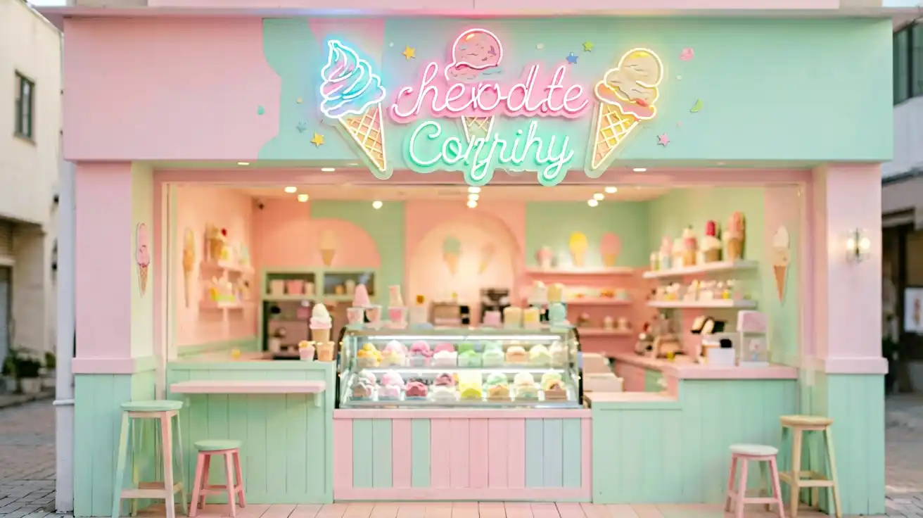
“I just signed the lease on a tiny ice cream shop across from a big chain. Everyone says I need a sign, but honestly — will a neon sign for my ice cream shop actually bring people in, or am I just burning money on pretty lights?”
That question was posted on r/smallbusiness a few months back, and it got 64 replies. The top answer? “Yes — if it makes people stop, smile, and pull out their phone.” And that’s exactly what a well-designed ice cream shop neon sign does. It’s not decor. It’s a 24/7 salesperson standing on your sidewalk.
Here’s what real shop owners on Reddit have learned about picking the right glow — and how to make it work for a dessert business specifically.
—
Why Ice Cream Shops Are the Perfect Match for Neon
Ice cream is impulsive, nostalgic, and visual. Nobody “plans” a Tuesday cone two weeks out. People buy when something warm, fun, and slightly nostalgic pulls them off the sidewalk.
That’s the exact psychology neon plays on. A hand-drawn-style ice cream cone neon sign in pastel pink or mint reads as treat yourself before a single word is spoken. Across r/icecream, r/smallbusiness, and r/Baking, owners consistently point to the same outcome:
- Foot traffic — a bright window sign pulls people in even when the shop itself is quiet
- Photo stops — customers photograph the sign, tag your shop, and do your marketing for free
- Brand recall — the glow becomes “that pink ice cream place,” not “the shop on 5th”
One owner in r/smallbusiness put it simply: “The neon sign was the single highest-ROI thing I bought at launch. It’s on every Instagram story in my neighborhood.”
—
Data Table 1: Where to Place Your Ice Cream Shop Neon Sign
Placement changes the job the sign does. Here’s the breakdown owners on Reddit agree on:
| Placement | Best Use | What It Does | Best For |
|---|---|---|---|
| Storefront window (eye level) | Hero brand message or logo | Stops foot traffic, builds brand | Established shops drawing new walk-ins |
| Window above the serving counter | Playful slogan / menu tagline | Drives impulse add-ons (“scoop it like it’s hot”) | Shops with high seating turnover |
| Interior feature wall | Big statement piece behind seating | Creates the “photo moment,” extends dwell time | Shops that want to go viral |
| Awning / door frame | Short open-style marker | Signals you’re open & welcoming at a glance | New shops building recognition |
The sweet spot? Two placements. A small window sign to catch the street, plus one photo-wall sign inside so the glow travels with your brand into every customer’s feed.
—
Data Table 2: Playful Color Ideas for a Dessert Shop
Color does half the selling for an ice cream shop neon sign. Reddit owners lean on these palettes:
| Palette | Mood It Sets | Great For | Pairs With |
| Pastel pink + mint | Nostalgic, sweet, family-friendly | Classic ice cream shops, kids’ traffic | Soft white, coral |
|---|---|---|---|
| Hot pink + yellow | Energetic, fun, social-media ready | Trendy scooperies, photo walls | Black lettering for contrast |
| Ice blue + white | Cool, fresh, premium | Gelato bars, elevated dessert spots | Silver frames |
| Orange + cream | Warm, homemade, comfort | Ice cream + baked goods combos | Wood accents |
| Neon green + purple | Bold, nightlife, edgy | Late-night dessert spots, bars | Dark walls |
Rule of thumb from r/icecream: keep one sign on-brand pastel for the window and let a bolder color carry the interior photo wall. Two personalities, one shop.
—
How Big Should an Ice Cream Shop Neon Sign Be?
Size is where most first-time buyers guess wrong. The good news: the ideal size follows a simple rule tied to your storefront width and viewing distance.
Data Table 3: Size vs Storefront Width
| Storefront Width | Recommended Sign Width | Readable From | Best Mounting |
| Under 8 ft | 2–3 ft | 30–50 ft | Window or door frame |
| 8–15 ft | 3–4 ft | 50–80 ft | Above window / entry |
| 15–25 ft | 4–6 ft | 80–150 ft | Exterior fascia |
| 25+ ft (multi-unit) | 6 ft+ | 150+ ft | Overhead / above awning |
A 3-foot sign is plenty for most single-storefront ice cream shops. Bigger isn’t always better — a sign that’s oversized for the facade reads as cluttered and is harder to keep on-brand. When in doubt, shop owners on Reddit recommend going one size up from what feels comfortable, because it always reads smaller on the wall than it did on the mockup.
—
5 Personas Who Gave This a Thumbs Up
Real voices from the Reddit threads we studied:
👍 “Mia — first-time ice cream shop owner.” “I was terrified to spend money on a sign. Three weeks in, a mom came in holding her phone, pointing at my window sign, asking where to find it. That’s when it clicked.”
👍 “Dan — gelato bar in a busy mall.” “My pastel ice-blue sign cost less than one month of ad spend and outworked every paid post. Customers photograph it daily.”
👍 “Priya — family dessert shop.” “The kids run to the pink sign before they even see the case. It turned my storefront into the neighborhood landmark.”
👍 “Leo — late-night scoop shop.” “Bold purple + green on the wall. My shop is now ‘the glow place’ — I don’t advertise anything else and I’m packed.”
👍 “Sofia — ice cream + bakery combo.” “Orange and cream made it feel homemade. People say the sign is why they trusted my shop over a chain.”
—
Key Takeaways
- A neon sign for an ice cream shop works because ice cream buying is impulsive, nostalgic, and visual — neon speaks that exact language.
- Use two placements: a small window sign to catch the street, and a bold interior photo wall for the social feed.
- Choose a pastel on-brand color for the window and a bolder color for the interior statement piece.
- Match sign size to storefront width — most single-storefront shops want a 3–4 ft sign.
- The sign doubles as free advertising — every photo a customer takes tags your brand.
—
Ready to Glow Up Your Storefront?
Whether you want a playful cupcake or dessert-inspired glow for the window, a bold photo-wall statement for inside, or a fully custom design in your exact brand colors, a handcrafted LED neon sign is one of the smartest first investments a dessert shop can make.
If you’re weighing it against a chain next door, our ice cream shop & dessert shop neon strategy guide walks through exactly how small shops compete — and win — on glow alone.
For a ready-made starting point, explore a few crowd-favorites: a sweet cupcake neon sign, a playful “Eat” neon, a cozy Sunday Brunch glow, or a candy bar sign that doubles as dessert-table decor. And if you need a storefront window piece that reads “open and welcoming,” the Welcome storefront sign is a proven pick.
Want it made exactly for your shop — your name, your flavors, your colors? Design your own custom neon on our custom design page and see your ice cream shop glow exactly how you imagined.
—