
Designing a custom neon sign is an exciting process, but translating an idea into a stunning finished piece requires understanding how neon design works differently from print or digital design. A custom neon sign design must account for line thickness, spacing between letters, color interaction, and how the finished piece will look in its intended space. This comprehensive guide walks you through every design decision so your custom sign looks professional, balanced, and beautiful.
Whether you are creating a personalized neon gift, a business sign, or home decor, the design principles remain the same. A well-designed custom neon sign follows specific rules about typography, color, spacing, and layout that are unique to the medium of light.
1. Typography: Choosing the Right Font
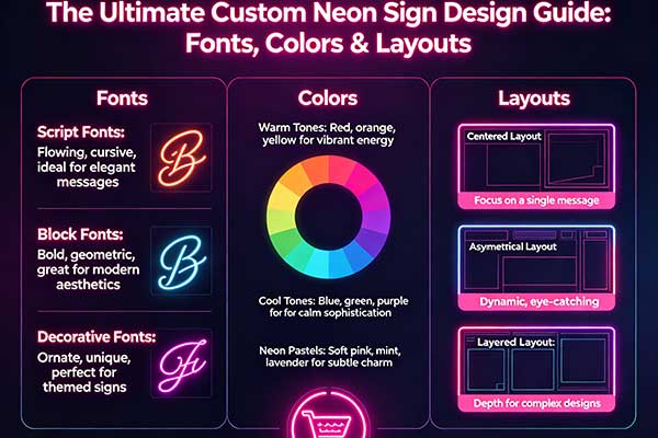
Font choice is the single most important design decision for your custom neon sign design. Script Fonts: Elegant and flowing—ideal for wedding signs, baby names, and decorative phrases. Keep script text under 4-5 words for readability. Sans-Serif Fonts: Clean and modern—perfect for business names, motivational quotes, and minimalist decor. Serif Fonts: Formal and traditional—good for established businesses and classic designs, though less common in neon. Block/Display Fonts: Bold and impactful—best for short words (3-4 letters) at large sizes. Avoid thin or highly decorative fonts for neon, as the light tube effect can make delicate details disappear.
2. Color Selection for Maximum Impact
Color choices dramatically affect how your custom neon sign is perceived. White and Warm White: The most versatile—works in any setting, flattering to skin tones, and pairs with any color scheme. Red: High-visibility, energetic—excellent for business signs and bold statements. Blue: Calming, cool—popular for modern homes and offices. Pink: Playful, romantic—top choice for bedrooms and wedding signs. RGB Multicolor: The ultimate flexibility—change colors to match seasons, moods, or brand campaigns. Our neon sign color guide provides deeper analysis of color psychology.
3. Layout and Spacing Rules
Unlike printed text, neon lettering requires physical space between each character. The minimum recommended spacing between letters is equal to the stroke width of the letters themselves. For multi-word signs, leave 2-3 times the letter spacing between words. For multi-line signs, leave vertical spacing equal to 50-80% of the letter height. These rules ensure your sign remains readable from a distance and does not look cramped. Check the neon sign size guide to match your text length to the right sign dimensions.
4. Single Line vs. Multi-Line Layouts
Single-line custom neon sign designs are the most common and work best for short phrases (1-5 words). They are compact, easy to mount, and fit in most spaces. Multi-line layouts work well for longer quotes, business names with taglines, or creating a balanced composition on large walls. When designing multi-line signs, consider line hierarchy—the most important words should be in the largest or boldest style. Centered alignment is most common for neon, but left-aligned layouts can create a modern, asymmetrical look.
5. Adding Visual Elements: Shapes and Icons
A custom neon sign design can include more than just text. Adding a shape—a heart, star, arrow, or abstract geometric element—creates visual interest and balance. Place decorative elements as accents rather than the main focus: a small heart above the “i” in a name, a star at the end of a phrase, or a circle framing a central word. For business signs, incorporating a simplified logo outline creates a truly branded piece.
6. Previewing Your Design Before Ordering
Most reputable custom neon sign makers provide a digital proof before production. This proof shows the exact layout, font, colors, and size—but it is on a flat screen, not in 3D. To visualize how your sign will look in your space, print the proof at actual size and tape it to the wall. This simple step reveals sizing and spacing issues that are invisible on screen. If anything looks off, request a revision before production begins.
7. Common Design Mistakes to Avoid
Too Many Words: Neon is best for short, punchy messages. Limit text to 6-8 words maximum for readability. Wrong Font Size for Distance: Letters smaller than 4 inches tall are difficult to read from across a room. Ignoring Wall Contrast: White neon on a white wall disappears. Ensure sufficient contrast between your neon color and the mounting surface. Overcrowding with Decor: Your custom neon sign should be the focal point—avoid placing competing wall art too close.
Related Articles
- How to Design Your Own Custom Neon Sign
- Neon Sign Color Guide
- Neon Sign Size Guide
- Custom Logo Neon Signs for Brand Visibility
8. Frequently Asked Questions (FAQ)
Can I use any font for my neon sign?
Most fonts can be replicated in neon, but simpler fonts work best. Avoid fonts with extremely thin strokes or intricate details that may not translate well to illuminated tubing.
How long does the design process take?
Design and proofing typically takes 2-5 business days. Complex multi-line or multi-color designs may take longer for revisions.
Can I change the font after I see the proof?
Yes. Most makers allow 2-3 rounds of revisions on the digital proof. Use them to get every detail right before production begins.
What file format do I need to submit my design?
Vector formats (AI, EPS, SVG) are ideal. High-resolution PNG or JPG with clear text also works. Hand-drawn sketches can be photographed and submitted for professional digitization.
9. Conclusion
Great custom neon sign design comes from understanding the medium. By choosing the right font and color, following spacing rules, and avoiding common mistakes, you can create a sign that looks professionally designed and perfectly suited to your space. Remember the golden rule: neon works best when it is bold, simple, and intentional.
7. Avoiding Common Design Mistakes
Even experienced designers can make avoidable mistakes when creating custom neon signs. The most common error is overly complex designs with too many small details—thin lines below 3mm width don’t illuminate clearly and can appear broken. Avoid fonts with tight kerning (letter spacing) as adjacent glow can blend together, reducing legibility. Another frequent mistake is inadequate contrast between the sign color and its mounting wall; a white sign on a light wall will appear washed out. Always test your color choices against your intended background during the design phase. Multi-line text requires careful spacing—leaving adequate gap between lines (minimum 1.5x letter height) prevents visual overlap. Symbols and icons should be simplified to their essential silhouettes rather than rendered with fine detail. Finally, consider viewing distance: what looks legible on your computer screen at arm’s length may be unreadable from across a room. Asking your manufacturer for a proof at actual size helps identify visibility issues before production begins. Avoiding these common pitfalls ensures your custom neon sign delivers the visual impact you envisioned.
Looking for the perfect neon sign for your needs? Check out our game over – retro arcade corner, our afk – gaming break sign for casual & competitive gamers, or our don’t forget to like – youtube cta neon to find exactly what you’re looking for.