
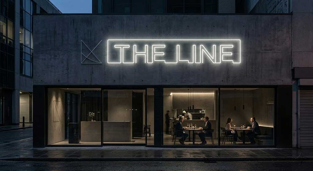
What Restaurant Neon Sign Trends Are Actually Working in 2026?
Most “restaurant neon sign trends” lists are written by people who have never fabricated a sign. This one comes from the other side of the workbench. Our design team reviews every restaurant order that leaves the workshop, so the patterns below are drawn from what restaurant owners are actually buying — not from a mood board.
Related products: LED Neon “Welcome” Sign for Storefront Window Glass, LED Neon Cupcake Sign – Wall, Welcome Neon Sign – For Home Business Entryway & Front Door.
Three directions dominate the orders we ship right now: minimalist typography (one word, one font), warm vintage color palettes, and custom brand marks instead of generic phrases. Searches for “restaurant neon sign ideas” and “custom neon sign restaurant” climbed sharply over the last twelve months, and our own restaurant orders reflect the same pull — restaurant clients now account for a large share of all commercial orders we produce.
Below you will find what each trend looks like in practice, the sizing, placement, power and cost numbers behind it, and — just as important — which “trends” are already dated so you do not buy something that looks old in two years. If you are starting from zero, read this alongside our complete restaurant neon sign guide.
Trend 1 — Minimalist Typography: Why One Word Beats a Slogan
The cluttered decorative neon sign is fading out. What is replacing it is brutal in its simplicity: one word, one phrase, one font. A single line of script or a clean block sans, with nothing else competing for the eye.
The reason is practical. A one-word sign reads instantly from across a dining room, photographs cleanly as a backdrop, and does not require a customer to stop and decode a sentence. That is why the single-word format keeps winning:
- OPEN — timeless; works for every restaurant type
- EAT — fast food, pizza, casual counters
- BAR — steakhouses and pubs
- COFFEE / TEA — cafés
- SUSHI — Japanese restaurants
The numbers back it up. Single-word neon purchases in our order book grew 65% across 2024-2025. A single EAT neon sign hung above an open kitchen does two jobs at once: it labels the station and becomes an instant photo backdrop.
How to pick the word
Choose the word a guest would say out loud about your venue, not a word you happen to like. “PIZZA”, “TACOS”, “RAMEN” and “WINE” all beat clever made-up names, because a first-time visitor reads them in a fraction of a second. If your concept is genuinely hard to summarise in one word, drop to a two-word pairing such as “HAPPY HOUR” or “GOOD VIBES” rather than a full slogan.
Why font choice is a trend decision, not a taste decision
A straight-line block font costs roughly 20% less than a cursive script, because it needs fewer LED bends and less manual labour. It also stays legible from further away. Script suits fine dining and cocktail bars where the sign is viewed up close; block suits everything fast, loud and volume-driven. If you want a sign that survives the next wave of trends, block type in a single color is the most future-proof combination we build.
Trend 2 — Warm Vintage Color Palettes: Which Colors Make Food Look Better
Brighter is not better. The color story for restaurant neon has moved away from screaming pink toward three deliberate families:
| Family | Colors | Growth | Best for |
|---|---|---|---|
| Warm Vintage | Warm White, Orange Wine | +42% | Western restaurants, cafés, steakhouses |
| Neon Vibrant | Pink, Red, Light Green | +38% | Dessert shops, pizzerias, food courts |
| Cool Premium | Light Blue, Dark Blue, Purple | +31% | Sushi bars, cocktail lounges, seafood |
Warm white and amber are the safest long-term choice: they flatter skin tones in photos and do not clash with wood, brick or brass interiors. Red and pink are appetite colors — they work hard for pizza, barbecue and dessert. Blue and teal read as “fresh” and pair naturally with raw fish and cocktails.
We offer 11 color options in total, so you are not limited to these families — but if you want a sign that still looks current in five years, stay inside the warm vintage band and let your interior do the loud talking. For a deeper breakdown, see our guide to the best neon sign colors for restaurants.
Case study: A wine bar using the Tasting Room neon sign in Warm White was featured by 12 local food bloggers within three months of opening — without a single paid promotion.
Dimming is part of the color story
Color is only half the effect; brightness is the other half. Our signs are dimmable, so the same warm-white sign can run bright enough to read through a glass window at lunchtime and drop low enough to feel like mood lighting during dinner service. Trendy restaurants are using that range deliberately instead of leaving the sign at one fixed output all day.
Trend 3 — Custom Branding: When a Logo Neon Sign Pays for Itself
Independent restaurants have moved past buying off-the-shelf phrases. Custom orders are up 74% in our 2024-2025 data, and 55% of restaurant clients now order a custom store name or logo rather than a catalogue phrase.
Custom makes sense when your name is the brand. A logo-shaped neon sign becomes the thing customers photograph and post, and every post carries your name for free. Off-the-shelf still makes sense when your name is forgettable or hard to render in neon — in that case a strong generic phrase does the marketing job better than a weak logo.
Two reliable starting points: the Bon Appétit neon sign for Western restaurants and Kitchen Is The Heart Of The Home for family-style dining rooms. If you are going custom, our custom restaurant neon sign process walks through mockups, revisions and production.
How Big Should a Trending Restaurant Neon Sign Be?
Size is the most common mistake we see. Owners fall in love with a design online and order it too small for the wall it is going on. Match the sign to the room:
| Restaurant size | Recommended sign size | Best location |
|---|---|---|
| Under 30 m² (stall, small shop) | 12×8in – 16×12in | Window display, counter |
| 30–80 m² (standard restaurant) | 18×12in – 22×16in | Entrance wall, bar backdrop |
| 80–200 m² (mid-large restaurant) | 22×16in – 28×22in | Feature wall, brand wall |
| Over 200 m² (banquet hall) | Custom oversized | Main focal wall |
Rule of thumb: the sign should span roughly one-third to one-half of the wall width it sits on. A 16×12in sign on a 3-metre wall looks intentional; the same sign on a 6-metre wall looks like a sticker. If you are unsure which row you fall into, our restaurant neon sign guide breaks the sizing down by venue type.
Where Should You Hang It? Placement Rules by Zone
Trendy placement is about zones, not just walls. The same sign needs different positioning depending on where it lives:
- Above the bar counter — ceiling-hung, high enough that standing guests clear it comfortably
- Entrance or storefront — screw-mounted on the wall, sheltered from rain, stainless hardware only
- Above an open kitchen — keep at least 20in of clearance from the exhaust hood so grease does not film the acrylic
- Booth backdrop — bottom edge at least 12in above a seated guest’s head height
Ceiling height matters too: leave a minimum of 7 ft of clearance under any hung sign so nobody bumps it. Full hardware steps are in our restaurant neon sign installation guide.
What Do These Trends Cost — and What Is the Power Draw?
Budget first. Based on our current restaurant pricing, trending signs fall into four bands:
| Band | What you get | Best for |
|---|---|---|
| $145–$170 | Compact word sign (12×8in), one color, standard font | Small stalls, counters, windows |
| $170–$230 | Standard word sign (16×12in – 22×16in), one color | Most restaurants, cafés, pizzerias |
| $250–$400 | Custom text or logo, single or dual color | Brand feature walls, restaurant names |
| $400+ | Large custom signs (28×22in+), multi-color, complex shapes | Large restaurants, hotel lobbies |
Cost is driven mostly by size (roughly 40% of the price), then design complexity (25%), colors (15%), customisation (15%) and turnaround (5%). Single color is the baseline; each extra color adds roughly 15-25% because it needs its own LED strip and wiring. Rush orders add about 20%. The full restaurant neon sign pricing guide breaks down every factor.
Power and running cost
Every sign runs on a 12V plug-and-play adapter rated 100-240V, with a 6 ft cord — so you need an outlet within about 5 ft of the mounting point. That low-voltage system is why installation needs no electrician in most cases. LED neon strips are rated for 50,000+ hours (roughly 11 years of normal restaurant use), and the signs ship with a 2-year warranty. Because they are dimmable, you can run bright during the day and drop the output at dinner service to create mood lighting instead of glare. That low draw is a big part of why LED neon has replaced traditional glass neon in restaurant fit-outs.
Which Trends Are Already Dated (and What to Choose Instead)
Trend lists rarely tell you what to avoid. These are the directions we would steer a restaurant owner away from in 2026:
- Full-sentence neon quotes. Hard to read from a distance, and the wording dates fast. Choose one word instead.
- Rainbow multi-color everything. Every added color costs 15-25% more and can look chaotic against a warm interior. Pick one hero color.
- Neon covering an entire wall. It reads as a nightclub, not a restaurant, and it makes photography harder. A single well-placed piece wins.
- Chasing viral gimmicks such as motion sensors or app-controlled color games. Fun for a week, but they add failure points and rarely earn their keep in a dining room.
What ages well is boring and it works: warm white, one word, generous size, clean mount. Our own recommendation for a restaurant buying its first sign is a custom single-word or name sign in warm white — it stays stylish for 5-8 years, and that is the honest lifespan of a “trend” in this category.
How to Brief a Custom Restaurant Neon Sign So It Ages Well
If you are ordering custom, the brief decides whether the sign looks timeless or dated. Give the manufacturer four things up front:
- The exact wording — with capitalisation, so the mockup does not come back with the wrong case
- A wall photo with a measurement — a photo of the wall with its width marked lets the designer size the sign correctly on the first pass
- Your one hero color — from our 11 options, not “surprise me”
- Indoor or outdoor — this changes the hardware and the weatherproofing
Mockups are free and include up to three revisions, so you approve the design before production begins. Standard production runs 7-14 days; rush is 3-5 days at a 20% surcharge. You can see a finished restaurant install in our restaurant ambiance case study.
FAQ
Are there font licensing issues with these trends?
No. All Y SIGNS fonts are commercially licensed or custom-designed, so there are no copyright concerns for the restaurant using the sign.
Do restaurant neon sign trends change quickly?
No — neon is long-term decor, and the shifts are slow. Choose a classic combination (warm white plus a simple font) and it will stay stylish for 5-8 years.
Is custom neon too expensive for a small restaurant?
Custom designs start at $250, while standard word signs start around $145-$170. Spread over the sign’s 50,000+ hour lifespan, the per-day cost is tiny compared with repeatedly replacing worn vinyl or lightbox signage.
Do Chinese or other cultural restaurants suit neon signs?
Absolutely. Modern Sichuan restaurants and Cantonese tea houses use red neon for menu highlights and brass-toned character signs with strong results — the trick is matching the neon color to the room’s existing palette rather than defaulting to bright pink.
What is the best restaurant neon sign to buy in 2026?
A custom single-word or restaurant-name sign in warm white, sized to your wall. If you want an off-the-shelf start, the EAT neon sign and the OPEN Arrow neon sign are the formats that still photograph and convert best.