
Why Most Creators Get Neon Lighting Wrong
You bought a beautiful neon sign. It looks incredible in person. But when you review your footage, something is off — your face looks orange, there is a weird reflection on your glasses, or the sign appears as a blown-out white blur instead of the soft glow you expected. You are not alone. Neon signs and video cameras have a complicated relationship, and understanding the technical details is the difference between a professional-looking setup and one that screams amateur.
This guide covers everything from color temperature science to practical placement hacks, written specifically for content creators who want their neon to look as good on camera as it does in person.
Understanding Color Temperature: The Foundation
Every light source has a color temperature measured in Kelvin. This is not about physical heat — it describes whether light appears warm and orange or cool and blue. Here is the practical breakdown for creators:
- 2700K to 3000K (Warm White): The color of sunset, candlelight, and cozy indoor lamps. Flattering to skin tones on camera. This is the most versatile neon color temperature for video content.
- 4000K to 4500K (Neutral White): Similar to midday shade or a cloudy sky. Works well for modern, clean aesthetics but can look clinical if overused.
- 5600K to 6500K (Daylight/Cool White): The color of direct sunlight or a bright overcast day. Best for tech and gaming content where a crisp, futuristic look is desired.
The critical mistake creators make is mixing color temperatures without intention. If your key light — the main light illuminating your face — is 5600K daylight, a 2700K warm neon behind you creates an orange halo that looks like a white balance error. The fix: either match your key light to your neon, or use the contrast deliberately for artistic effect.
The Three-Light Rule for Content Creators
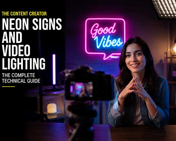
Professional video lighting uses three layers: key light, fill light, and back light. Your neon sign should be treated as either the back light or an ambient accent — never the key light. Here is how to integrate it:
Key light (your face): A ring light, softbox, or window light positioned in front of you at eye level. This is the brightest element and should match your neon color temperature.
Fill light (shadow reduction): A smaller, dimmer light on the opposite side of your key light. This softens shadows without eliminating them entirely.
Neon sign (ambient accent): Placed behind and to one side, dimmed to 30 to 50 percent. It should never compete with your key light for brightness. If your camera auto-exposure keeps adjusting when you turn the neon on, it is too bright.
This three-layer approach creates cinematic depth — your face is crisp and well-lit, the neon adds atmosphere, and the shadows provide dimension.
Dimming: The Secret Weapon
Full-brightness neon is rarely the right choice for video. Here is why: camera sensors have limited dynamic range. If your neon is too bright relative to your face, the camera must choose between exposing for your face (blowing out the neon into a white blob) or exposing for the neon (making your face a dark silhouette).
The solution is simple but often overlooked: dim your neon sign to 30 to 50 percent of its maximum brightness. This brings the neon within the camera dynamic range, allowing both your face and the sign to be properly exposed simultaneously. Most Y SIGNS neon signs include remote-controlled dimming — use it.
A practical test: record a 30-second clip of yourself speaking at your normal streaming position with the neon at various brightness levels. Review the footage on the device your audience will use — a phone screen — not just your editing monitor. What looks properly exposed on a calibrated monitor often appears too bright on a phone.
Placement Angles: The Glare-Free Zone
If you wear glasses, neon placement requires extra attention. The physics is simple: light reflects off glass at the same angle it arrives. If your neon sign is positioned directly within the reflection path between your glasses and the camera lens, it will appear as a bright reflection in your eyewear.
The solution: position your neon sign at least 30 degrees off-axis from the camera-to-face line. Imagine a line from your camera lens to your eyes — keep your neon sign outside of a 60-degree cone centered on that line. If you are not sure, record a test and look for reflections.
For contact lens wearers or those who do not wear glasses, you have more flexibility, but the same principle applies to any reflective surfaces in your background — glossy posters, picture frame glass, or shiny desk surfaces.
RGB Color Selection for Specific Skin Tones
Different neon colors interact differently with skin tones on camera:
- Fair skin: Warm white, soft pink, and peach tones are most flattering. Avoid cool blue and harsh green, which can emphasize redness or create a washed-out look.
- Medium and olive skin: Warm amber, coral, and rose gold tones enhance natural warmth. Cool colors can work but should be tested — some cyan tones create an unflattering contrast.
- Darker skin: Rich warm tones — gold, magenta, warm red — create beautiful contrast and dimension. Cool white can work for a high-contrast editorial look but should be tested at various brightness levels.
The universal safe choice for content creators of all skin tones is warm white dimmed to 40 percent. It adds atmosphere without altering skin color perception.
Common Technical Mistakes and Their Fixes
Mistake: Neon creates a colored cast on your face. This happens when the sign is too close or too bright. Move it farther behind you or dim it further. The neon should illuminate your background, not your face.
Mistake: The neon flickers or pulses on camera. This is usually caused by PWM dimming interference between the LED driver and your camera shutter speed. Try adjusting your camera shutter speed to a multiple of your local power frequency — 1/50 or 1/60 in most regions — or increase the neon brightness slightly.
Mistake: The sign looks blurry or out of focus. If your camera autofocus is hunting, the bright neon may be pulling focus away from your face. Switch to manual focus, lock focus on your face, and leave it there. The neon will naturally be slightly soft in the background, which actually looks more cinematic.
Mistake: The sign appears too small on camera. Remember that wide-angle webcam lenses make background objects appear smaller than they do in person. A 16-inch sign that looks substantial on your wall may appear tiny in a 1080p webcam feed. Size up by 20 to 30 percent from what looks right in person.
The Bottom Line
Neon signs and video cameras can coexist beautifully — it just takes understanding the technical fundamentals. Start with warm white, dim to 40 percent, position off-axis, and test before going live. With these basics dialed in, your neon sign becomes an asset, not a liability, in your content creation toolkit. Browse our creator-friendly neon signs designed with video performance in mind.