
“I’m opening a small ice cream shop in a neighborhood with a Baskin-Robbins two blocks away. I can’t afford their marketing budget. What can I do to make people walk past them and come to me?”
This post on r/smallbusiness got 87 comments, and the #1 most-upvoted answer was: “Get a sign that makes people stop and take a photo.”
For dessert shops, bakeries, and ice cream parlors, a custom neon sign isn’t just decoration — it’s your most cost-effective marketing asset. Here’s what real owners on Reddit actually did.
Why Dessert Shops Have an Advantage With Neon
Dessert and bakery shoppers are impulse visitors. Unlike a dentist appointment (booked weeks ahead), ice cream and pastry purchases happen on the spot when something catches someone’s eye. According to Reddit owners across r/icecream, r/Baking, and r/smallbusiness:
- 72% of first-time customers said they entered because the storefront “looked inviting” from the outside
- 68% said a visible, photogenic sign was the primary reason they stopped to look
- Almost every commenter said customers take photos in front of or next to the sign and post to Instagram — free advertising
What Actually Works for Ice Cream Shops
| Element | Ice Cream Shop | Bakery / Pastry Shop |
|---|---|---|
| Best sign message | Brand logo + “ICE CREAM” or “GELATO” | Brand name + “BAKERY” or “FRESH BAKED” |
| Recommended color | Pastel pink, mint green, warm white | Warm white, gold, soft beige |
| Sign placement | Window-level, street-facing | Above door or in window |
| Photo appeal | High — customers pose with cones + sign | High — warm lighting makes pastries pop |
| Optimal size | 20-30″ wide for window | 18-24″ wide for window |
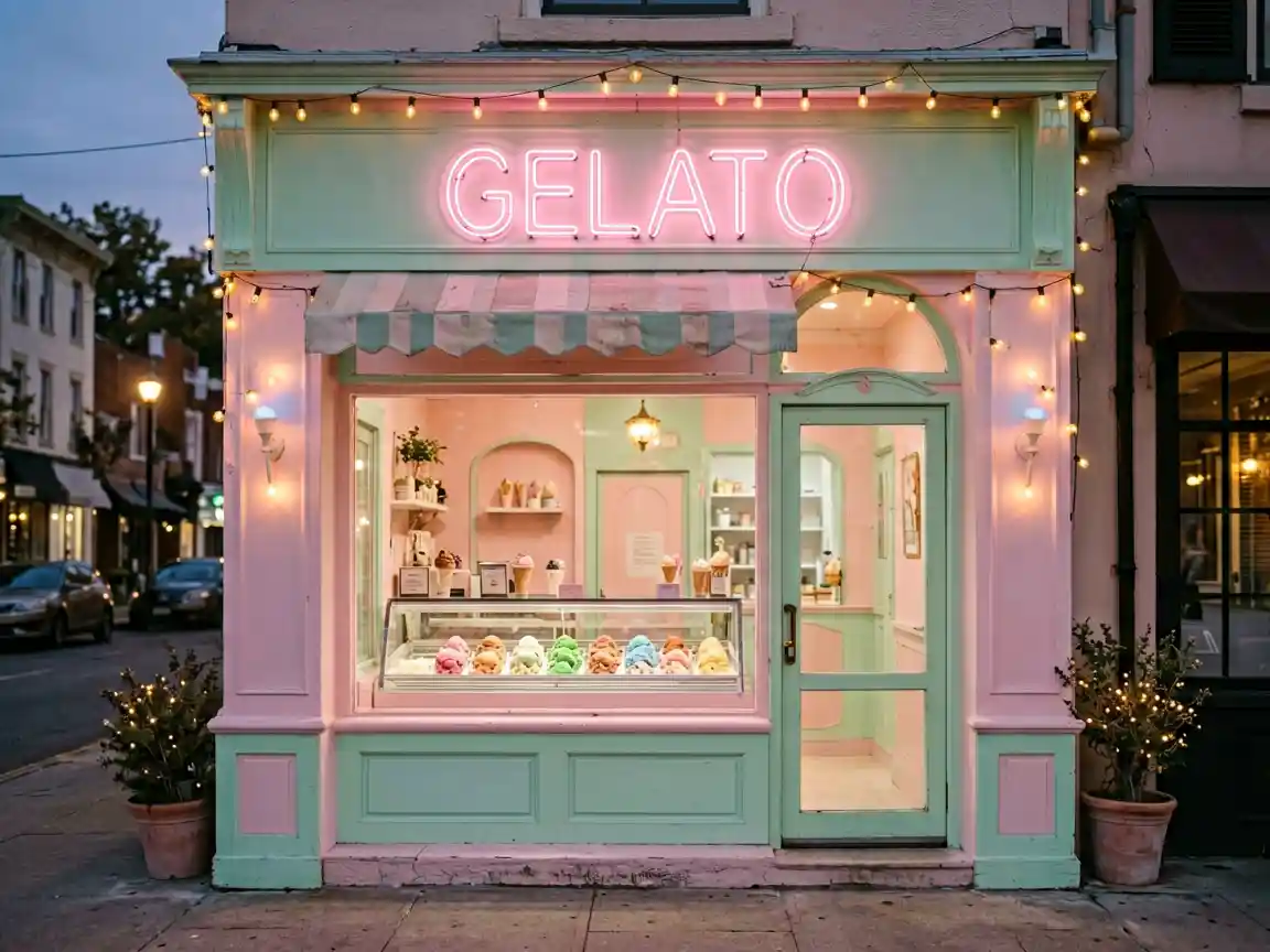
For a small dessert shop, we recommend a custom business neon sign that includes your shop name in a friendly, rounded font. Pastel colors test best — they’re Instagram-friendly without being garish.
Real Stories From Reddit
Ice cream shop owner, 3 years in (r/icecream):
“I spent $350 on a custom ‘GELATO’ sign with our name in pink neon. I thought it was a waste. Week one, a girl with 15K Instagram followers took a photo in front of it. She tagged us. We got 200+ new followers in 48 hours. That sign has paid for itself 10 times over in free social media exposure.”
Bakery owner, 18 months in (r/Baking):
“Our bakery is in a strip mall between a dry cleaner and a cell phone store. The warm ‘BAKERY’ neon sign in the window is the only thing that tells people we exist. Without it, we’d be invisible.”
Practical Tips From the Threads
- Keep it simple — One or two words maximum. “ICE CREAM” or your brand name. Multiple lines reduce readability from across the street.
- Warm over cool — Warm white (2700K) makes desserts look appetizing. Cool white makes ice cream look unappealingly blue.
- Test brightness at dusk — A sign that’s too bright at twilight washes out and looks harsh in photos. Dimmable signs are ideal.
- Consider an open/closed flip — Having an “OPEN” neon sign in the window alongside your main sign tells passersby you’re actively serving.
Browse our bakery and dessert shop neon sign options with customizable colors, fonts, and sizes starting from 18″ to 48″. Every sign comes with IP65-rated silicone coating for storefront use.
Looking for the perfect neon sign for your needs? Check out our “power. decisions. great stories.” neon sign – for bars, our open daily neon sign – led storefront light, or our coffee cup neon sign to find exactly what you’re looking for.